Continuing my previous blog post that you can find under this link and third part here.
I'd like to start with talk about empathy.
Emphatic Design
I'm a strong supporter of user-centered design in games. In the end, we are making products for people to enjoy. In Clash Royale, we can find many examples of this approach.
There are many benefits of emphatic design. When you take care of your users they respond with loyalty. That leads to better retention and this leads to higher conversion rate into paying users.
Emphatic design has also long term effect on players. The chance of player coming back, after leaving our game with negative emotions is low. In contrast, player leaving with positive emotions often comes back to check on new updates. When developer is releasing new game it's much easier to convince players to try it, because of those positive memories.
User Acquisition cost for mobile games grows every year. So when we acquire that player to our game, we should put his well-being as our top priority.
I will mention few things that we already covered and they are important for user-centered design.
Properly implemented notifications. Players know what they want to do in the game, don’t force them to spend their precious time on other things.
Minimalistic shop with a clear description of items. Most people don’t spend money (~5% users pay). But the ones that do, want that experience to be good. So, don’t force players to hate that experience because they won’t go to the shop anymore.
Portrait mode greatly helps with one hand interface. Mobile games are all about experiencing game while you are mobile. Many players don’t want to sit and spent 100% of their focus on a game.
Interactions
People often have different habits when interacting with UI. Changing user habits is really difficult. Best-case scenario is creating UI that can be used in few different ways, and reach as many users as possible. Obviously, it takes more time and analysis. Clash Royale developers thought about it and gave players the ability to use parts of the interface in few different ways.
Gameplay is a key part of the game and in this place, we have that ability. In Clash Royale, gameplay is all about dropping cards on the battlefield, so developers gave us 2 ways to do it.
Drag&Drop – You drag card from the bottom part of the UI to destination.
Tap&Tap – You can tap on the card to select and tap to place it on the battleground.
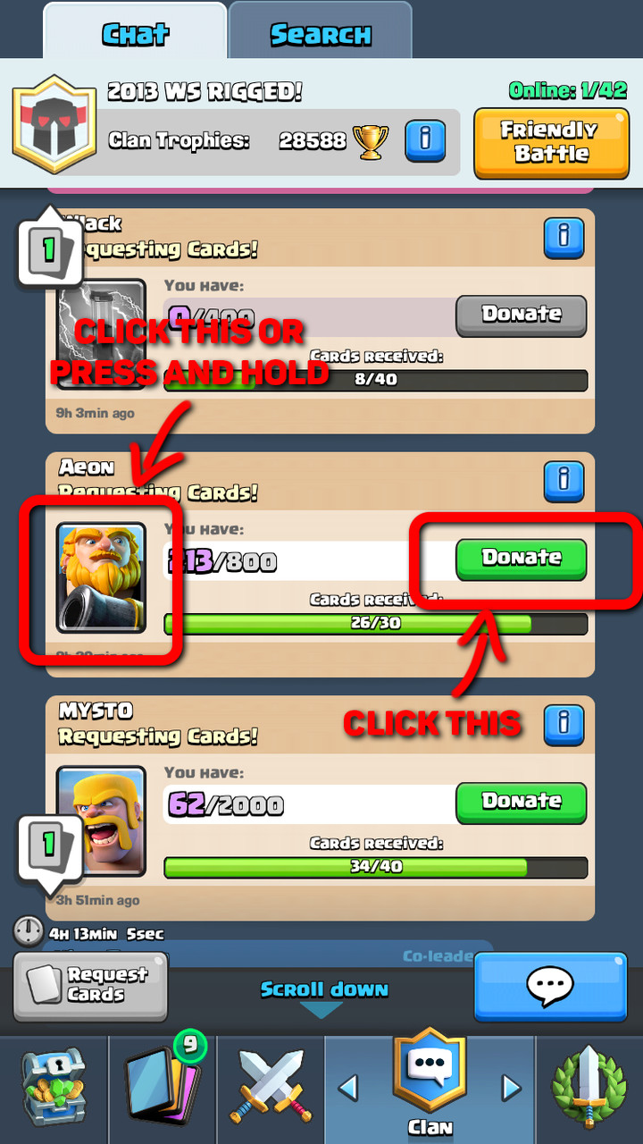
Main menu of the game has also many improvements in this area. We can donate cards to other players in two different ways:
Tap "Donate Button"
Tap or Hold (To donate multiple cards) card image on the donation request
Menu navigation:
Swipe left and right to change view
Tap the icon on the bottom to change view
Opening Chests have also two modes. Slow and fast opening, it's a small improvement but after having to open 100+ chests it’s a huge time and anxiety saver.
User Interface
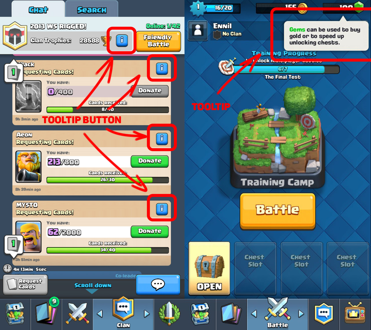
Tooltips
Clash Royale uses tooltips in confusing places, so player can always learn through interaction. Look of info button is always the same, so players quickly learn meaning. It's important with minimalistic UI's to sometimes have those "guides". It’s a fine balance between not enough information and too much of it. Tooltips are a cheat that allows to widen this fine spot.
Economy
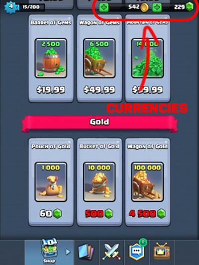
Economy in the game is based on two currencies, soft and hard. This is at least a bit less confusing than having 4 currencies like many other games. One currency for everything would be perfect but there are important advantages to using dual currency in free to play scheme. Main advantage that concerns players is that having premium and soft currency allows for better control of in-game economy. If developer fails to control economy everything starts to fall apart. In-game prices are growing rapidly and often players have too many items. On a high level, game economy resembles real-life economy.
Going back to empathic design. It's easy to forget about being empathetic toward our players. Introducing 4+ currencies into our game won't make it easy for players to understand relations between them. Also, having 10 categories in your in-game shop because of the amount of currencies will not help either.
Overcomplicating this part leads often to decrease in revenue and user experience instead of the opposite.
Gameplay
Gameplay is what games are all about, this is where players spend most of the time. It's vital to focus on user experience in here because it will define your game.
Gameplay interactions
When interaction is well matched with user expectations it doesn’t bother players. Otherwise, it might happen that they will complain about broken game, horrible gameplay and other things that are likely not the core of the problem. Player feedback is valuable but needs to go through person that interprets that feedback.
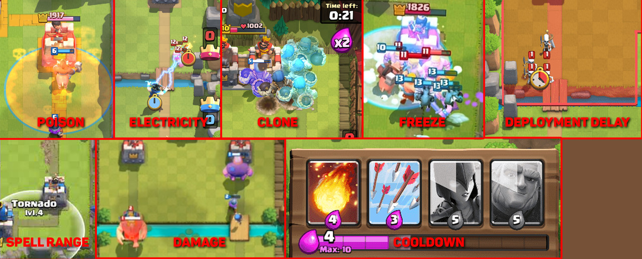
Clash Royale developers focused on clear and understandable gameplay by limiting distractions. Because of that, players can focus on the gameplay and game supports them by providing all needed information. Key gameplay interactions that we can find are:
Spell range, visible with red or blue based on the team
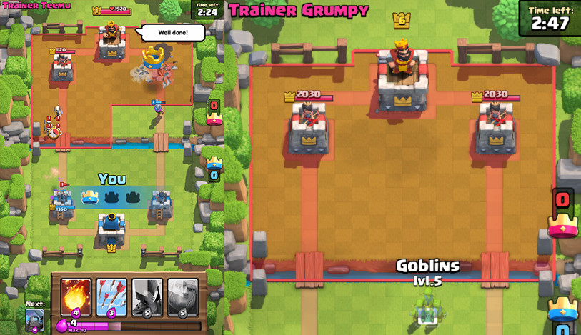
Unit drop available area. Some units are able to drop on the enemy’s side
Deployment time varies between units
Damage visual effect to indicate that units are giving damage to enemy
Visual effect when units get statuses like freeze or poison
Different visual cues.
In here, I want to stress that consistency with interactions is elemental. Players need to create a habit when reading information and doing interactions. When those are consistent player can develop mastery. That improves their immersion in the game and allows them to enter flow state much easier. Clash Royale is a real-time competitive game, so interactions are win or lose condition for players. The importance for this element should be clear.
Placement importance
Clash Royale gameplay is all about timing, positioning and resolving mini skirmishes around the battlefield. I already mentioned that each unity has unique deployment delay and some units can be deployed on the enemy side. We have also a grid of equal rectangles so when we are placing unit, game algorithm snaps them to that grid. Placement is important because it affects unit target. Depending on the placement unit can target tower, building or number of enemy units.
By introducing grid, developers improved user experience in a big way. It allowed them to have clear definition of a unit. Character description can specify attack range for example, Archer has range of 5 tiles. It allows players to quickly measure distance in the heat of battle. Without grid and unified measurement, players would have hard time doing that in real time.
Different deployment areas.
Tutorial
Tutorial in games is usually one of the most underfocused part of the game. And yet it's the key element to engage players in first few minutes. You might lose even 10% of your user base by having bad UX in tutorial.
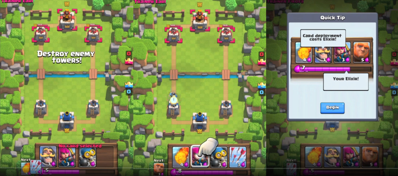
In Clash Royale, tutorial throws you in first second straight into the arena and tells you to defeat the opponent. It doesn't treat players like idiots. It suggests what to do but doesn't limit your movement. You still have the freedom to do whatever you wish. Tutorial mechanic doesn't break the flow of the game by forcing specific actions.
It also doesn't end after the battle. It continues the same as if you would play a normal game but with guides. The only moment that tutorial limits your movement is when upgrading card for the first time. This part could be done better, so it doesn't limit user, but the key element in the tutorial is to engage user as soon as possible. This is achieved by throwing player into the arena in first seconds after starting game. The implementation of the tutorial allows players to get immersed. First few games are against AI and they might be tailored but it's hard to tell without knowing the implementation. After 7 wins you can participate in PVP battles. So tutorial allows users to learn the game with AI and then they are thrown into online battles.
Guides in the tutorial.
Player Communication
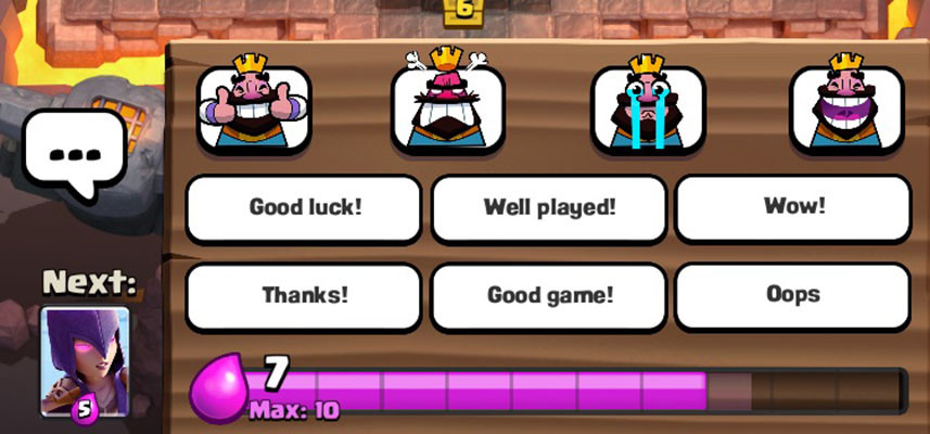
A common problem in online games is in-game toxicity. Many top titles have that problem like League of Legends, many MMORPGs, and mobile games. By not including global chat and limiting communication in the arena to predefined emotes and texts in the gameplay, Supercell effectively cut most of the toxicity from the game. You can still freely chat in the clan but players can control that by themselves so it doesn't affect toxicity as much.
I am personally in favor of limiting verbal and text interactions in games. Instead, I prefer focus on interactions between players in the gameplay itself. A good example of that approach is Journey made by That Game Company. Forcing people to interpret different signs or emotes we allow players to create their own world of communication and usually, it's more positive.
One of the most common reasons why people play mobile games is to relax. For this group of players emotes in Clash Royale can evoke negative emotions. They are not offensive but players often dislike some of them (laughing emote). But it's hardly toxic. In the CR community, there were many voices to implement permanent mute for in-game interactions. Developers responded that they believe that interaction is part of the experience. If they are right it's hard to judge, I'm personally split in the opinion.
In-game communication.
This is not the end. Next part and last one will be about technical things and art. Stay tuned!
