

Welcome to my new series of articles discussing UX in games. If you want to jump straight to my analysis scroll down to chapter called "The Good ". This article is divided into 3 parts, you can find second part in here and third part here.
With this text, I will try to answer a question: Why Clash Royale is so popular and why UX is a big part of it? My personal goal with this series is to get into the habit of analyzing games and explain this analysis in an understandable way for anyone who wants to hear about it. I would like also to spread appreciation for UX in games and art. I think it's a neglected topic in many areas of game development. We artists are possessive of our own kids (art), so we feel threatened by everything that tries to influence us directly. I’m sure other disciplines feel similar, that is why UX experts have a hard time convincing people to listen to them.
I encourage readers to comment and let me know how I can improve my future articles. Ideally, I would like to see a discussion about this important topic. UX is crucial because it saves time for users, a small change can lead to hours of time saved for your audience.
Why UX? Because I care about players and I want them to enjoy products that I make.
UX gains special meaning on mobile platforms due to the types of devices and games developed for them. Common things in mobile game market are casual games, short play sessions, and social interactions. UI is often really simple, gameplay readable and you need to be able to play it outside in the real world.
I see user experience as a design philosophy that focuses on combining science and empathy toward end users. Part of that is generosity, but it doesn't mean making the game easy. It means understanding your audience and creating the game tailored to it. That is why I want to start this series with a game that cares about players in an interesting way.
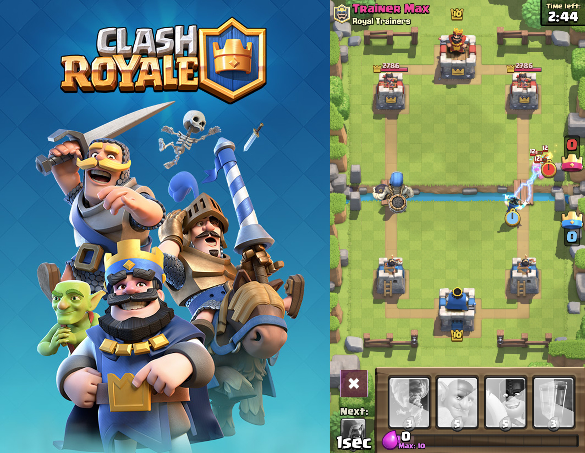
Clash Royale
Clash Royale was released in March 2016 by Supercell, one of the most successful companies on mobile market. It earned already more than billion dollars. It's a competitive arena card battler. The game is a very interesting case of a game with a small scope, great UX, deep gameplay and high-quality graphics. I’m mainly interested in UX part, but since UX is everywhere we will touch all kinds of disciplines.
Clash Royale is not a perfect game, but UX-wise it does pretty good job. It suffers from common live product problems. Live games need to meet player expectations, so developers add new features and content. That makes the game grow and usually UX suffers from it. But I would like to start with basics, so let’s start from the beginning.
Clash Royale
The good
Simplicity, Minimalism
Being moderate in game development is really hard, we developers always want to add more features to our games. When crafting UX, being moderate is always a struggle. Minimalism and simplicity are perceived as something worse by many. Yet, it's the key element when it comes to creating fantastic user experience. I'm going to try and defend that statement, so bear with me.
One hand interface
One hand interface might not be a "must have" feature for every game, but it definitely improves user experience. It allows your players to play the game in more situations and places. And that can help you improve retention in your game.
Imagine a player that play games traveling home, in a bus, standing holding handhold.
Nowadays, phones are part of the social element, so lowering "requirements" is key to make this experience better. Developers of Clash Royale made sure that all key elements of the interface are within reach of your finger, while using phone with one hand. I need to point out that I don't take into account "Reachability" feature on iOS that allows to reach top of the screen without using second hand. For the sake of the article, we can ignore it since it's not part of the game.
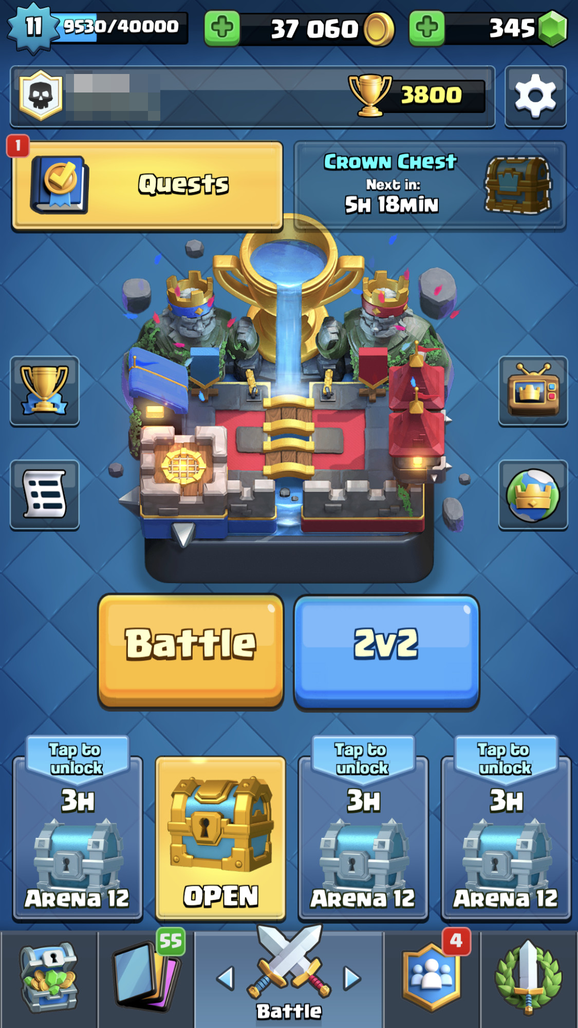
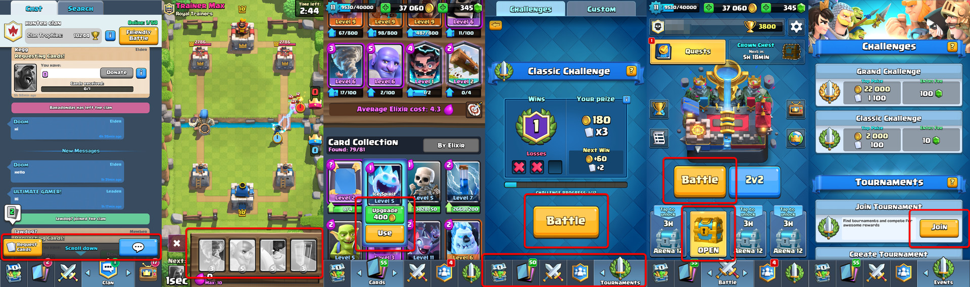 I highlighted with red outline key functionalities in the game, all of them are positioned within lower 50% of the screen.
All main functionalities are available when using one hand
- Menu bar is on the bottom
- Card donation feature is on the bottom
- In the battle, card deck is on the bottom. Dragging/Tapping is initiated from the bottom of the screen
- Chest area is on the bottom
- Popups are never full screen and tapping on the background closes them
Highlighted area closes the window.
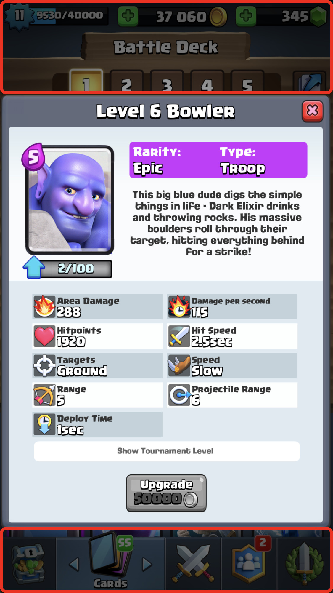
UI depth
There is something interesting with CR interface. The deepness of the UI almost never goes more than one level, and in some special cases when it does it is cleverly hidden to look like one level. On top of that most of the popups are not fullscreen. Why are those things important? Few reasons:
People get easily confused when going through multiple windows, they forgot how to get back, they lose track and interface can overwhelm them. This is frustrating and that hurts their experience.
There is something called Mental Model which is a representation of the surrounding world and their relation in user’s brain. It’s important to create an interface that user expects and knows how to interact with. Showing a popup and not fullscreen window helps the user to orient himself. He can see previous UI behind popup window. It’s a detail, but with UX details are everything.
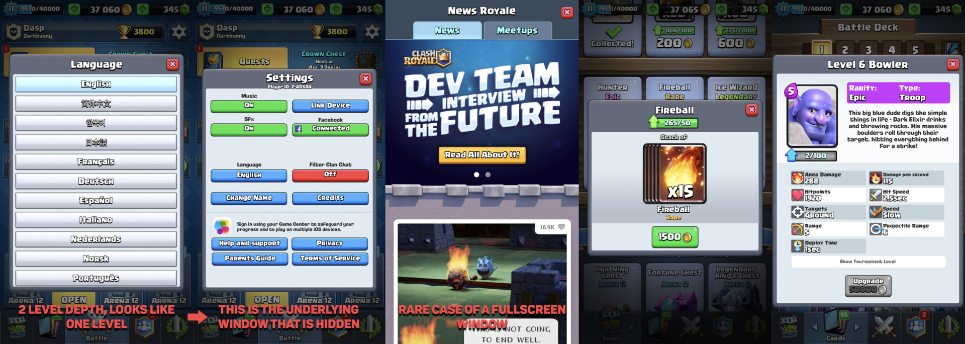
All types of window in Clash Royale UI.
One menu to rule them all
In the main menu, bottom of the screen is occupied by shortcuts that allows navigation between different screens. Having menu always visible in the UI is really convenient for navigation. Users won't have problems with orientation and they would feel that they are in control of the interface. They can always come back to the place they need to. Division of the shortcuts is intuitive because it’s based on different categories of needs that players might have.
- Social, everything about communicating and interacting with other players
- Battle, functionality connected to core gameplay
- Shop, items and currencies available to buy
- Cards, deckbuilder with all cards and upgrades
- Events, tournaments and special events
Main screen.
Cognitive Load
This part focuses on the limitations of the brain. Humans can process limited amount of information at once. After certain point they start to get overwhelmed and confused. UI needs to be designed with that in mind.
In-game shop
When analyzing the in-game shop we can see that it's very minimalistic. Usually, we have up to 6 items on the screen and no more.
There is something called The Paradox of Choice, in short, having too many options to choose from creates anxiety. Our short-term memory can hold up to 7 items -+ 2 depending on the person. Forcing people to memorize big amount of information or making them do calculations in memory can create a really bad experience for our customers.
Putting all that information together shows us why it's so important to be conservative with the amount of information we show to players. Clash Royale shop is a really good example of that:
- The shop has small number of items to choose from
- Clear distinction between items
- Special offers are clearly highlighted.
- Discounts are explained with one line of text
Some might say that making shopping experience great doesn't create a better player experience. That in the end, they might spend more money that they don't want to spend. I believe that players should be treated with respect and they should have the freedom of choice. That’s why giving all information needed to reach a decision without creating anxiety makes it best environment for them to decide for themselves.
I'm personally a fan of previous in-game shop version that was in Clash Royale. It was simpler with less information on the screen. I also understand the reasons to change, which are tightly connected to game economy itself. However, the shop is still one of simplest ones that you can find in the mobile game market.

Old shop, new shop and special offer.
Modesty with notifications
I'm really passionate and emotional about this one. Every game that has more than one popup at the beginning of the session should burn in hell. Game session length on mobile platforms is about 2-5 minutes. Forcing player to go through multiple popups (even 2) after opening the game is waste of players time. Usually, players won't focus on the information delivered to them because they enter the game with a specific goal. Much better option is to limit those popups to a maximum of one or having notification bubble somewhere in the UI. Clash Royale uses both options with great respect for players and I think unconsciously, players are thankful.

The only notification screen that you can find at the start of the game.
Key UI elements need special treatment
It's already really common in games to use unique and bright colors for important UI elements. It's no different in this case. Clash Royale uses yellow color (which is first and last color that people see in their life) for buttons like Enter Battle, Request Cards, Use Card and Invite Friend. Usually those elements beside yellow color, they have special visual effect like animated highlight.
Secondary color that highlights other less important functionalities is green. It's used for functions like Donate, Buy and Upgrade Card.
The red color is used as notification color. Dominant color of the UI is blue and it's used in the background and other less important elements.

As an example, I took main screen of the game and blurred it a bit to show what elements are clearly visible for the players.
This is all for now, stay tuned for second part where I will talk about empathy design, gameplay and more...